 Facebook
 X
X
 Pinterest
 Copy Link

Hello there! I’m Windermere Real Estate’s Chief Economist, Matthew Gardner, and welcome to the latest episode of Mondays with Matthew.
This month, we are going to take another look at forbearance activity across the U.S. Now I know that we have talked about this subject several times over the past year, but it is worthwhile to look at it again if only for the fact that the program stopped taking new applications for forbearance at the end of June.
So, let’s take a look at where we were when the forbearance program started and where we are today.
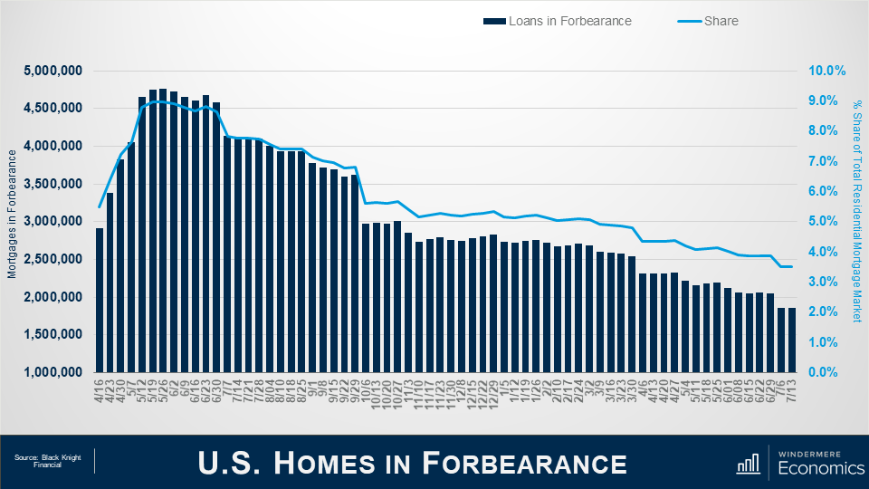
And as you can see from this first chart, the situation today is a vast improvement from where we were last May when there were more than 4.76 million homes in the program. For context, that meant that more than 9% of all homes with a mortgage were in the program last May – a huge number.
But the latest data from Black Knight Financial shows that – by mid-July of this year – the number had dropped to just over 1.86 million homes, or roughly 3.5% of houses with a mortgage.
This is certainly a pretty impressive recovery, as it means that 2.9 million homeowners left the program between May of 2020 and mid-July 2021.
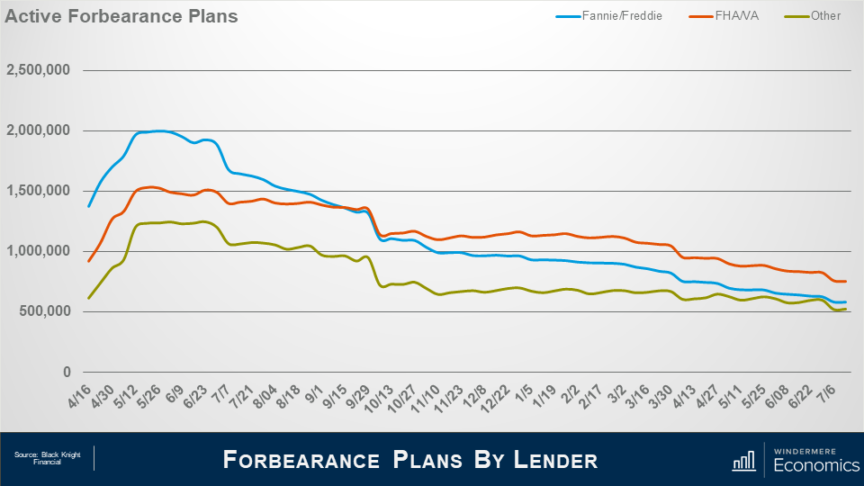
And when we look at the makeup of mortgages in forbearance, the largest share came from loans backed by Fannie Mae and Freddie Mac – not surprising given the size of their mortgage portfolio – with, at the peak, just shy of two million homes in the program – roughly 7.2% of their total portfolio.
But that number has now dropped to 582,000 or just 2.1% of loans outstanding.
Loans backed by the FHA or VA also peaked last May at about 1.53 million or 12.6% of their portfolio.
But today that number has dropped to 755,000 or 6.2% of the mortgages they hold.
And finally, loans showed here as “other” represent private label securities or portfolio loans, and it’s interesting to see that their numbers didn’t peak until late June when just short of 1.25 million homes – or 9.6% of their portfolio – were in the program.
However, today that number had dropped to 524,000, or 4% of mortgages backed by these entities.
What I see from the slides that we have looked at is that the number of active forbearance plans continues to fall; however, the pace of the drop has certainly slowed over the last quarter or so.
After seeing a monthly drop of 12% in April – as a large volume all plans hit their 12-month review date – the pace of improvement has since slowed to just 5% over the past 30 days.
Although the number of homes in forbearance is still higher than I would like to see, fewer than 4% of all mortgages are in the program and we haven’t seen this level since April of 2020, just as the pandemic was kicking in.

As we look forward, you can see that almost 600,000 homes currently in forbearance are coming up for review so the potential for a greater rate of improvement in the overall number of homes in the program is certainly possible – but not guaranteed.

Unsurprisingly the number of homes entering the program for the first time as well as repeat plan starts is lower than we saw last summer but again the pace of improvement has slowed. That said, overall starts are down by 3% on the month and when we combine new and repeat starts the number is 3 to 4% lower.
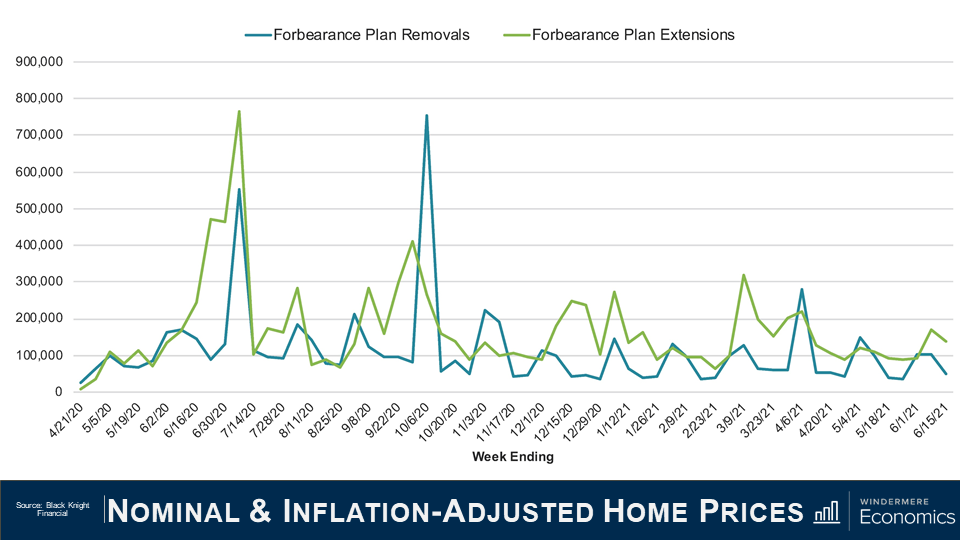
Of the roughly 460,000 homes in forbearance that were reviewed for either extension or removal from the program in the first two weeks of June, 33% left the program while 67% had the term extended. This is a lower removal rate than we saw during the first two weeks of either April or May, but I expect to see more homeowners come out of the program, but only as long as the country continues to reopen, and that is not a certainty given the rise of the Delta and Lambda variants of the COVID-19 virus.
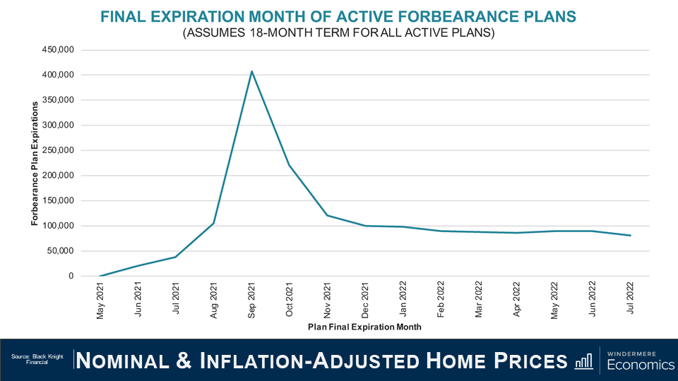
I actually found this chart to be very interesting. Of the more than two million active forbearance plans, approximately half are scheduled to reach their 18-month terminal expiration date in September and October of this year.
And if we take this data, and then project a fairly modest 3% monthly rate of homeowners leaving the forbearance program, it means that over 900,000 homes would exit the program in the third and fourth quarters of this year.
And with 575,000 thousand plans scheduled to expire in September and October alone – that means that mortgage services will be faced with the daunting task of having to process nearly 15,000 plans per business day during that time. It’s going to be a lot of work!
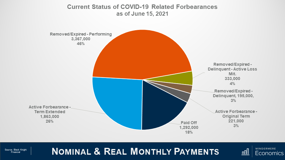
Roughly 7.25 million borrowers have used the forbearance program at one time or another through the course of the pandemic and that represents roughly 14% of all homeowners in the country.
Of that 7.25 million, the chart here shows that 72% have left the plan, and 28% remain in active forbearance, but you can also see that loan performance remains pretty robust among homeowners who have left the program with 46% of them getting things squared away with their lenders in regard to missed payments, and 18% having paid off their loan in full – likely from selling or refinancing with a different lender.
You will also see that the number of borrowers in post forbearance loss mitigation is down a tad to 333,000, while those who have left forbearance but still remain delinquent and not in loss mitigation accounts for roughly 3% of total loans in the program or just 195,000.
So, the way I see it, although the number of homes leaving the program has certainly slowed which, quite frankly, doesn’t surprise me, I still expect further improvement as we move through the year not just because the economy continues to reopen and people are getting reestablished at work, but also because we won’t be seeing any new owners enter the program.
And finally, I want to show you what parts of the country have a high share of homes in forbearance.
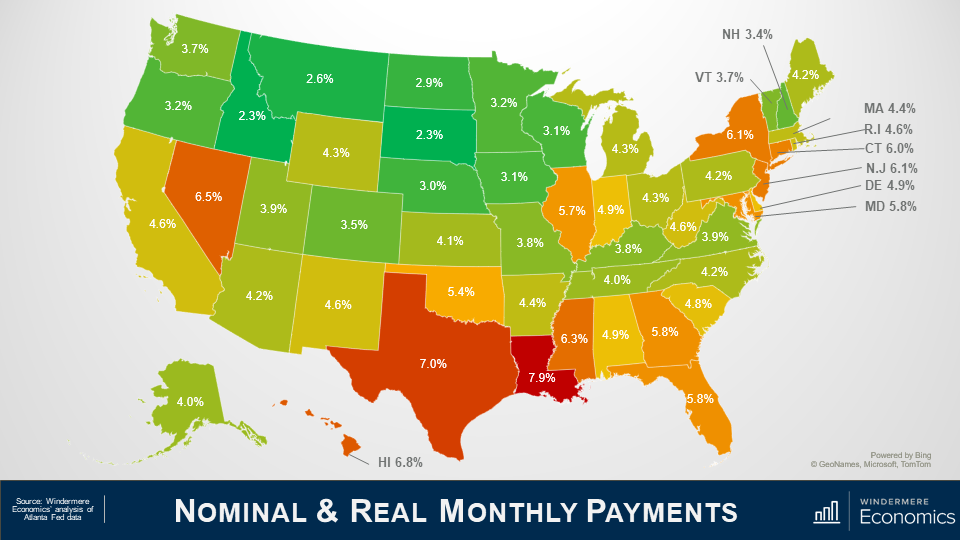
I must tell you first off, that this data isn’t that timely – in fact these numbers are from March as the data I get at the State and County grain is subject to a three month lag.
Anyway, as you can see from this map, not all states are created equal, with the share of homes in forbearance still elevated in Louisiana, Texas and, to a lesser degree, New York State.
Out here in the West, the rate in Nevada is still high, and California and New Mexico are both somewhat higher than I would like to have seen but, as I just said, this data is a little old, and I believe that the share of homes in forbearance in both Nevada and California is lower today than you see here.
Given everything that we’ve looked at today, there are a couple of conclusions that can be drawn.
The first, and most obvious, is that anyone believing but there will be a flood of homes that will be foreclosed on either toward the end of this year or in 2022, is likely to be disappointed. Even if every home still in the program does enter foreclosure which, by the way, is basically impossible, the number of homes that would be foreclosed on would be minimal when compared to the fallout following the financial crisis of more than a decade ago.
And when I say that it’s virtually impossible to expect to see all homes will be foreclosed on, it’s mainly because of the remarkable run up in home values that the country has seen since 2012.
The buildup of equity that all homeowners have seen whether they bought before 2012, or even as recently as the past 2 or 3 years, suggests that if, for whatever circumstance, owners in forbearance can’t get their heads back above water, they will choose to sell their home – in order to keep the equity that they have accumulated.
A typical homeowner in forbearance has a sizeable equity in their home, with median equity of a homeowner in the program measured at just over $100,000. And this significant amount of cash in their homes would allow them to pay the bank back any missed payments, sell, and still walk away with a sizable amount of equity.
The bottom line is that have the forbearance program was needed and it can be said that it has been successful so far in warding off home foreclosures because of the remarkable impact of the pandemic.
Although it would be naïve to suggest that foreclosure rates won’t rise at all, as the forbearance program winds down, I do see them ticking higher but, given all the data that I’ve been looking at, I would be very surprised to see overall foreclosure rates rise to a level significantly above the long-term average.
Well, I hope that you have found this month’s discussion to be interesting. As always if you have any questions or comments about this topic, please do reach out to me but, in the meantime, stay safe out there and I look forward the visiting with you all again, next month.
Bye now

